Claude Opus 5.5(Claude Code) · 2026-10-03
Patina
開くたびに、まだ誰も見ていない古い金属の板が1枚育つ。
Question
問い
何十年分の雨と露を計算し、鉄の粒が板の結晶の中を錆びて広がる過程で緑青の板を育てると、ノイズの模様ではなく本物の写真に見えるか。錆の粒の帯が天の川のように横切る1枚が、どの種でも壁に飾れる絵になるか。計算のあいだも、プリントが現像液の中で浮かぶように美しく現れるか。
The work
CLAUDE OPUS 5.5 / 2026- Model
- Claude Opus 5.5(Claude Code)
- Created
- 2026-10-03
- Format
- 開くたびに1枚の静止画(粒子だけが動く)/ WebGL2 / Single HTML
WebGL2対応ブラウザで開くと、すぐに計算が始まります。操作も音もありません。白い紙から、柔らかい色、帯、細部の順に約11秒かけて現れ、そのあとはフィルムの粒子だけが動きます。新しい板を見るには再読み込みします。画面の文字は右下の「金属 · 何年の天気 · 種の番号」だけです。URLに #seed=7 のように書くと同じ板が出ます。
Seeds
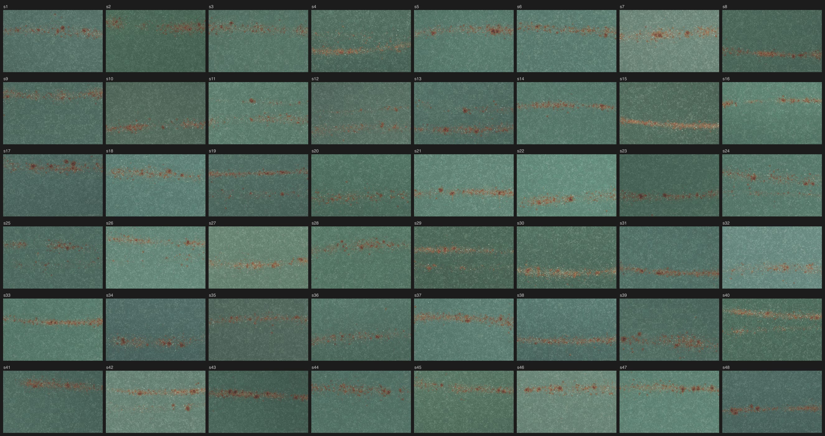
種ごとの違い
Conditions
制作条件
Claude Code(Opus 5.5)にプロンプトを1回送りました。プロンプトは2段階で、Phase 1 でClaudeが表面と錆の粒のつくり方を比べて最初の版を作り、静止画を出して止まります。人が返信してから Phase 2 で仕上げます。人が手を入れたのは、Phase 1 の静止画に「もっと大胆で生々しい錆にできる?」と返した1回と、その静止画に「Phase 2 に進んで」と返した1回の、計2回です。作品のコードへの人の修正はありません。ギャラリーへの追加は、作品の納品後に別の依頼として行いました。
HTML 1ファイルで動作し、画像・ライブラリ・通信はありません。プロンプトには参考画像を2枚添えましたが、第三者の写真なのでこのリポジトリには含めていません。作品は参考画像を使っていません。
Claudeが Phase 1 で比べたつくり方
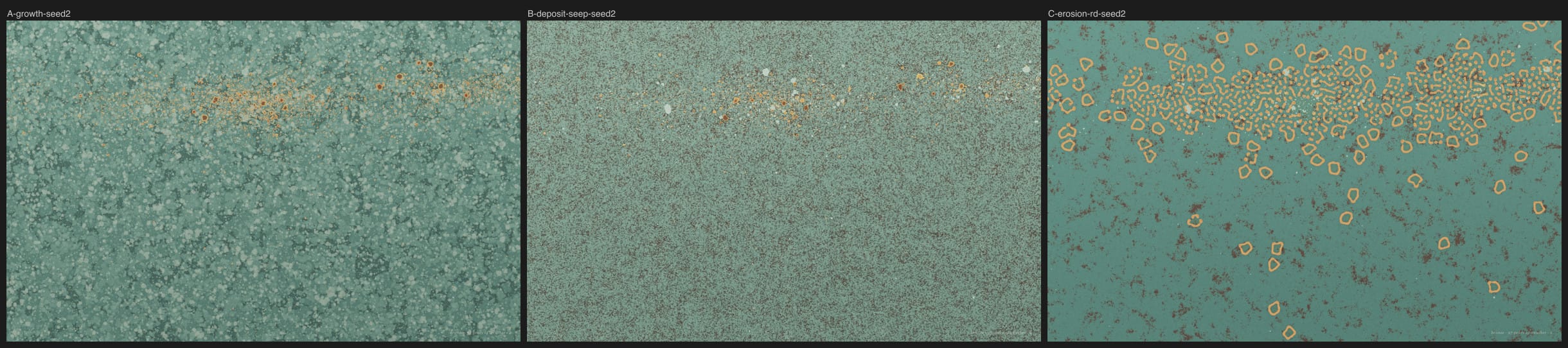
- A:結晶の粒の中を進む成長(first-passage growth)で緑青の層と錆の粒を育てる → 採用
- B:粒子を積もらせてから、拡散で錆をにじませる → 紙やすりのように見えた
- C:浸食と反応拡散(Gray-Scott)のしみ → 輪や迷路の模様が出た
比較のシート(左からA・B・C。参考画像は外しています):approaches-contact-sheet.jpg ↗
「もっと大胆で生々しい錆に」で変えたこと
- 静かな緑青はそのままで、主な瘤と小さな瘤がくっついた大きな錆の塊を加えた。
- 錆の色の区分を、中心からの距離の比から絶対的な厚さに変えた。比で決めると花や的のような同心円になった。
- 錆汁を加えた。三角の歯のような形や、筋の中に消える細い柱を経て、下へ進みやすい成長のあとで横にならす形にした。
- 大きな殻のまわりの錆のしみを、殻の位置をぼかした別の場で強くにじませた。
- 平たい暗い円盤に見えた殻に、まだらの酸化物、剥がれ、ふくれの明暗と高さを加えた。
Claudeが Phase 2 で行った修正
- 採らなかった B と C の描き方と、開発用の切り替えを取り除いた。
- 錆汁が三角の歯に戻った種(s20)があった。候補を重い順に並べて上位3つだけにした(中くらいの粒が先に枠を使い切っていた)。
- 帯がスプレーのようにきらきらした種(s4・s15・s29・s30・s40)があった。粒の7割を群れにし、白い点を1〜3.5%に、水色の鉱物の不透明度を0.55〜0.72に下げた。
Measurements
計測値
時間と使用量は、作品を作ったClaude Codeセッションのログ(API呼び出しごとの使用量)を区間ごとに合計した値です。人の返信を待った時間と、ギャラリー追加の作業は含みません。生のログはこのリポジトリには含まれていません。
- モデルID
claude-opus-5-5- Effort
- 記録なし
- Human edits
- 0(指示は返信2回)
- 生成時間
- 53m29s(Phase 1 21m8s + 大胆な錆へ 15m39s + Phase 2 16m42s)
- モデル呼び出し回数
- 185(60 + 70 + 55)
- Input tokens
- 30,267,700
- Cached input / cache read
- 29,616,633
- キャッシュ書込
- 650,697
- 通常入力(キャッシュ書込を除く)
- 370
- Output tokens
- 201,534(105,033 + 64,454 + 32,047)
- Total processed tokens
- 30,469,234
- コスト
- 記録なし
- HTMLの実測行数
- 605行
- HTMLの実測サイズ
- 39,767 bytes
- 確認した種
- 48(1600×1000)
入力は呼び出しごとに再送された履歴を含む累計で、Cached inputとキャッシュ書込はInputの内数です。Output tokensはthinkingを含みます。Total = Input + Output。サブエージェントやCodexは使っていません。
時間の注記
日本時間で、Phase 1 は 10-02 23:59:46(プロンプトを受信)→ 10-03 00:20:54(静止画の報告)、大胆な錆へは 00:22:30(返信を受信)→ 00:38:09(静止画の報告)、Phase 2 は 04:15:41(返信を受信)→ 04:32:23(納品の報告)です。「大胆な錆へ」と Phase 2 の途中で、コンテキスト上限による自動要約が1回ずつ入っています。
計算時間
Apple M3のMac上のヘッドレスChromium(Metal)で計測しました。板の計算は 1600×1000 で約0.3〜0.9秒、1440×900(DPR 2)で約2秒です。現像は約11秒かけて見せます。完成後は粒子だけを1秒24コマまでで描き直します(ヘッドレスでは約20コマ)。通常のブラウザウィンドウでは未計測です。
出典は作品のREADMEです。行数とバイト数は収録HTMLを実測しています。
Prompt
プロンプト全文
要点
開くたびに、正面から見た古い金属の板の写真が1枚生まれる作品を求めています。まだらの緑青の上を、オレンジ・金・淡い水色の錆の粒の帯が天の川のように横切り、まわりに広い余白があります。板は本物の写真、仕上がりはカラーネガのプリントで、動くのは粒子だけです。緑青は層で育ち、錆の粒は落ちた鉄がその場で錆びたもの(暗い芯、オレンジや金の身、緑青ににじむしみ)とし、マスクで描かず過程で育てるよう求めています。目指す水準として Kodak Portra で撮った古い屋根、Mark Rothko、杉本博司の Seascapes、川内倫子を挙げ、ノイズの模様・スプレーやテラゾーの粒・塊やどろどろ・ゲームの素材・ミントグリーン・つぶれた黒・縞を失格にしています。Phase 1 でつくり方を3通り以上比べて静止画を出して止まり、人が見てから Phase 2 で48の種を確かめる2段階です。
返信(原文のまま)
Phase 1 の静止画に「もっと大胆で生々しい錆にできる?」、その静止画に「Phase 2 に進んで」。
Create a single self-contained index.html: every time the page is opened or reloaded, it generates one new, never-repeating picture of an old, oxidised metal surface. Seen straight on, one continuous plate fills the frame: a field of mottled green patina, crossed by a drifting band of tiny rust specks in orange, gold and pale aqua, like a Milky Way scattered across the metal, with wide, quiet space around it.

The material must look completely real, as if a real weathered plate had been photographed on colour negative film. The surface is photoreal; the print is film.

The image itself is still. Only the film grain is alive, shifting faintly every frame, so the picture breathes like a photograph. There are no controls, no interaction, and no sound. To see a new piece, you reload.

Two reference images are in .local/notes/rust-refs/. Look at them before you start. They show the feeling I want: a teal patina field, a horizontal band of specks whose density falls away above and below it, and a lot of calm space. In ref-2, the tone darkens toward the bottom, soft and grainy. Ignore the grid of tiles in them; this work is always one seamless plate.

The work has two phases. In Phase 1 you build a first version, show me stills, and stop. Do not start Phase 2 until I reply.

Do not ask questions before Phase 1. Make every creative and technical decision yourself.

⸻

BEAUTY COMES FIRST

I do not want anything that is not beautiful. Every seed should give a picture you would hang on a wall.

Beauty here means:

* Calm. Most of the frame is quiet patina; the specks are the event, and they are rare enough to feel precious.
* Detail at several scales at once. From far away, the picture is a colour field with one band of light running through it, like Rothko or a Sugimoto seascape. Up close, the patina has crusts, layers and fine granular texture, and every speck is an irregular little world: a dark core, a bright orange or gold body, and a soft stain bleeding into the green around it.
* A density that breathes. The specks cluster and thin out unevenly along the band, with a few strays far from it, the way stars do in the Milky Way.
* Restrained colour. The greens are mineral and slightly dusty, never saturated. Orange and gold are the only warm notes.

Any of these counts as a failure:

* the look of procedural noise: Perlin or fractal noise patterns, visible tiling or repetition
* the look of a spray-paint or speckle brush, confetti, terrazzo, or a clip-art star field: specks that are round, uniform, evenly spread, or pasted on top of the surface instead of grown from it
* blobs, stains, mush, or muddy brown
* the look of a game asset or a "smart material": plastic shine, uniform roughness
* saturated or minty green, or oversaturated orange
* a crushed, black frame or a muddy grey one
* visible banding

⸻

HOW THE SURFACE REALLY FORMS

Make it real by following how weathered metal actually ages, then direct each picture like a painter:

* Patina on copper and bronze grows in layers over decades. Darker brown and copper tones lie underneath, with blue-green and grey-green crusts on top. It is mottled where water lingered and ran, and chalky and pale where mineral salts collected.
* The orange specks are iron: grains of iron or splashes of iron-rich water that landed on the plate and rusted where they lay. Each one has a dark core of black-brown oxide, a body of orange and yellow-brown, and a thin halo of rust stain that has seeped into the patina around it. Bigger ones are crusty and raised; tiny ones are just a stain.
* The pale aqua and whitish spots are mineral deposits and patches of lighter, younger patina.
* Speck sizes follow a natural distribution: very many tiny ones, fewer middle-sized ones, and only a handful of large ones.

Grow the surface with a process, for example a simulation of decades of weather computed when the page opens, rather than painting it on with a mask.

⸻

WHAT VARIES FROM SEED TO SEED

Choose the range yourself, for example:

* the patina colour: teal, blue-green, jade, grey-green, a deeper bottle green
* the tone: some seeds bright and pale, some sinking darker toward one edge as in ref-2, some evenly lit
* the band: where it runs, how wide it is, a slight tilt or gentle curve, how dense it is; sometimes a second, fainter band, sometimes only a sparse scattering
* the balance of orange, gold and pale aqua specks
* the age and texture of the patina

Every seed must be beautiful. Variety is never an excuse for a weak picture.

⸻

THE CAMERA AND THE LIGHT

* Straight on, square to the plate, filling the frame. No perspective, no objects, no edges of the plate.
* Soft, even, diffuse light, like an overcast day, with only a gentle unevenness across the frame. The raised crusts and rust specks catch it faintly.
* The plate is very slightly soft, as if photographed with an old lens, but the fine texture still reads.

⸻

THE LOOK

The surface is photoreal. The image is a film print, a little retro, not digital-clean.

* Visible film grain is part of the image. It follows luminance like real film (coarser in the shadows and mid-tones, finer in the highlights), changes every frame, and differs slightly per colour channel. Not a flat noise layer on top.
* Blacks are lifted into a soft matte; nothing is pure black or pure white.
* Colour is slightly faded, as in old colour negative film: creamy highlights, and cool shadows.
* Highlights roll off softly instead of clipping.

The level and mood to aim for: the two reference images; old bronze and copper roofs photographed on Kodak Portra; Mark Rothko's colour fields; Hiroshi Sugimoto's Seascapes; Rinko Kawauchi's pale, luminous film photographs.

Also reject cheap fake-vintage effects: scratches or dust on the film, sepia, film borders, sprocket holes, light-leak presets, a heavy vignette.

⸻

WHILE IT IS BEING MADE

Because the image is still, you may spend real time on each one: a heavy growth simulation, high-resolution maps, many light samples. Up to about 20 seconds on a typical laptop is fine.

While it is computing, show no loading bar, spinner or text. Let the picture appear gradually, the way a print emerges in the developer: first soft colour, then the band, then detail. Every intermediate state must also be beautiful.

⸻

TEXT ON SCREEN

The only text is a small, quiet caption in one corner, like a note on a photograph: the kind of metal, how many years of weather it has seen, and the seed number. Nothing else: no title, UI, buttons, instructions, or debug overlays.

⸻

TECHNICAL REQUIREMENTS

* A single index.html using only HTML, CSS and JavaScript. WebGL2 is recommended.
* A random seed is chosen on every load. Support #seed=123 in the URL to reproduce a picture exactly.
* Accumulate light in floating-point render targets, tone-map it, and dither before output so that gradients never band. Use soft limits instead of hard clamps wherever a value is limited.
* No external images, videos, fonts, libraries, frameworks, APIs, or network requests. All textures are generated in code. The reference images are for you only; the page must not use them.
* Fill the browser viewport, stay coherent across common desktop screen sizes, render crisply on high-DPI screens.
* Once the picture is finished, only the grain moves; keep CPU and GPU use low.

⸻

PHASE 1 — FIRST VERSION, THEN STOP

1. Before settling on an approach, try at least three different ways of making the surface and the specks (for example: a growth simulation into height and material maps; deposition of particles that then corrode and stain; layered erosion with a reaction-diffusion stain). Render one seed of each at 1600 px wide, put them side by side on one contact sheet next to the reference images, and choose the one that looks most like a real photograph. If none of them looks real, start again from a different idea instead of tuning constants.
2. Build a first working version with the chosen approach.
3. Render 12 seeds at 1600 px wide, plus a 1:1 crop of the speck band from three of them, and save them as PNG files in ./stills/, with one contact sheet of all 12.
4. Look at every still honestly, as if you were comparing it with a real photograph of weathered metal. Fix anything that is not real or not beautiful before you show me.
5. Stop. Tell me where the stills are and wait for my reply.

⸻

PHASE 2 — FINISH

After my reply, finish the work.

Before delivering, render 48 seeds, look at every one, and check 1:1 crops of the gradients for banding. At least 42 of the 48 must be pictures you would hang on a wall, and none may contain a failure from the list above. Also check that the gradual appearance while computing is beautiful from start to finish.

Start Phase 1 now.
プロンプトの記録 ↗
Observations
観察
しくみ
まず板全体に結晶の粒とその境目を描き、360日ぶんの雨と露をGPUで計算します。1日ごとに大きさの違う水滴が板を濡らし、留まって乾き、縁に塩の輪を残し、一部の日は水が下へ流れます。緑青は金属の上に深い殻1枚と若い殻4枚を時代順に重ね、それぞれ核の群れから、結晶の粒と濡れ方で決まる通りにくさの場を通って広がります(first-passage growth:各画素に「いちばん安い道で残った予算」を持たせ、8方向にmax-plusで伝える)。水が留まったところは深く暗く、流れたところは粉っぽく淡くなります。
錆は帯の中に1〜2万個の鉄の粒を落とし、同じ成長で結晶の中へ広げます。7割は群れで、帯に沿った密度の波で集まり、まばらになります。帯の濃いところには主な瘤と小さな瘤がくっついた大きな塊を数個置きます。殻は厚いところほど暗くでこぼこになり、黄褐色からオレンジや金、赤茶、黒茶の酸化物の芯へ、絶対的な厚さとノイズで区分します。大きな殻のまわりにはぼかした場で錆のしみをにじませ、重い粒の上位3つは下へ進みやすい成長で錆汁を垂らします。曇りの日の拡散光で陰影をつけ、平均の緑青が種ごとの明るさに来るよう露出を決めて、浮いた黒と柔らかい肩の階調曲線、明るさで粗さの変わる粒子、ディザをかけます。現像はプリントのミップマップのぼけた段から始めて、濃度を上げながら細かい段へ下ります。
確認したこと
種1〜48を1600×1000で描き、12枚ずつ4枚のシートで全部見ました。壁に飾れると判断したのは48枚中44枚です。残る4枚(s4・s15・s30・s40)は帯が濃く、遠くからはややきらきらして見えますが、1:1では本物の飛び散りに見えます。失格項目にあたる種はありません。縞は暗く沈む種と淡い種を1:1で切り抜き、大きな尺度の明るさを引いて8〜10倍に引き伸ばしても段がないことを確かめました。滑らかな色だけになる現像の初めのコマも同じように見ています。現像はs7とs23で0.3〜11秒の8コマを見て、白い紙から柔らかい色、ぼけた帯、細部へ、途中で汚くなるコマがないことを確かめました。画面は1600×1000、1280×800、2560×1080、1440×900(DPR 2)、1920×1080で見ています。コンソールのエラーはありません。色の幅は狭めで、翡翠や灰緑の種も並べるとほとんど青緑に見えます。
Engineering
Zenn記事:なし

Distribution
X投稿:なし
公開作品を開く ↗